Redefining Shutterfly’s Brand System
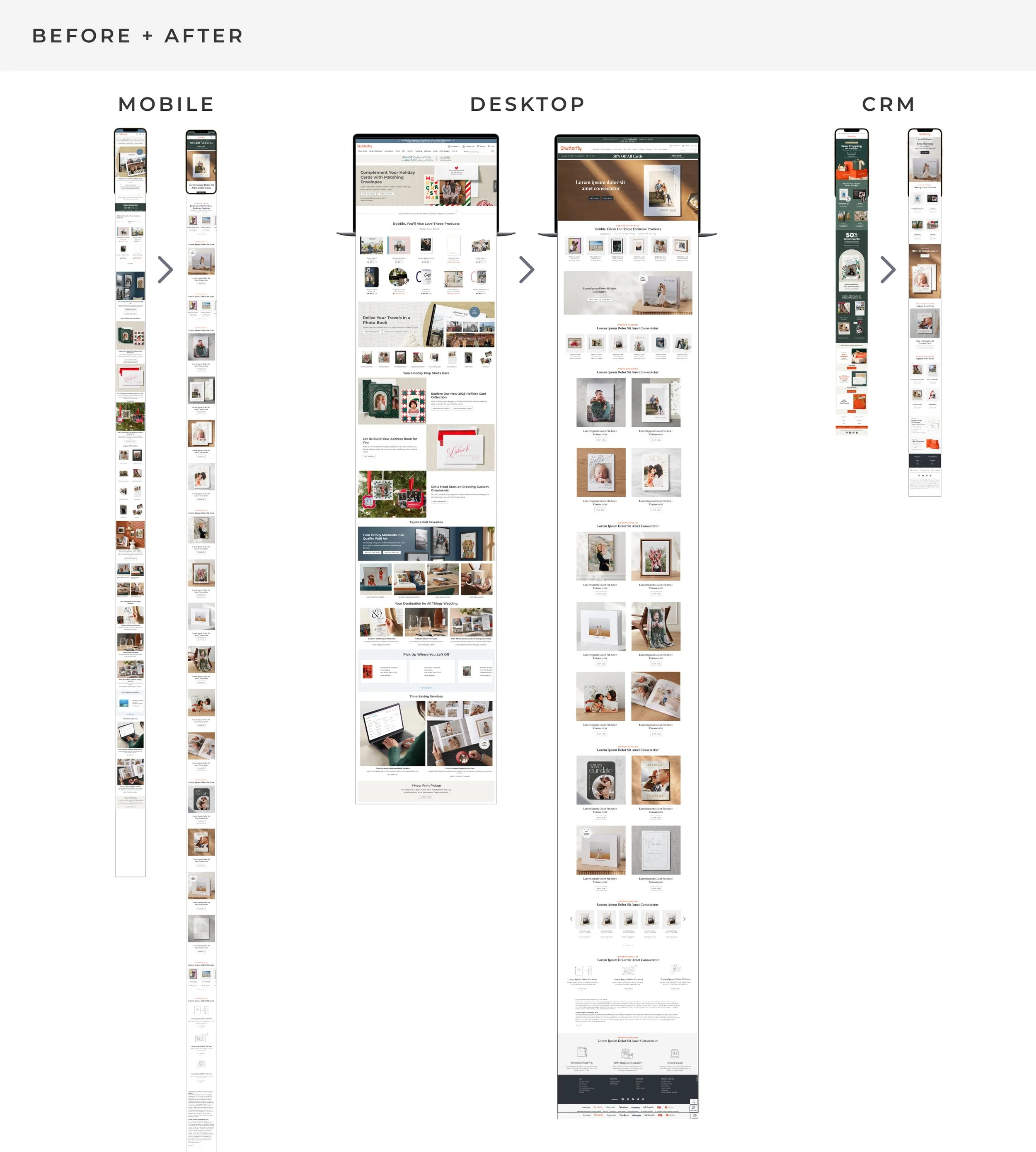
We created a new look for Shutterfly by amplifying and defining standards for photography, typography, illustration, design system. It’s a system intended to be an interim solution as Shutterfly, replacing a light and generic brand to a system, while waiting for more insights and customer segmentation from an agency who is also taking this work the next step further.
We defined the following details as best practices for what makes our new look successful: photography, typography, illustration, and a mobile focused design system.
Typography
I led landing a refined typography approach for the brand. There was a strong desire to add a modern serif font (high contrasting strokes, a tall x-height, and refined serif finishes) to serve as a design element and to set up proper hierarchy while keeping the existing brand font, Montserrat.
First, I developed criteria and a scorecard for research and filtering possible fonts.
A set of 15 fonts were initially analyzed which was then narrowed down to three. Next was a deep dive into letterform analysis, font family possibilities, ADA, and testing them out. Ivar Headline was ultimately chosen.
Implementation included making decisions on usage, creating guidelines, and rolling out libraries for consistent and quick use.
Illustration
The previous brand system was void of any illustration or iconography (aside from UI purposes). We knew there was value in adding it for instances in which photos were not the strongest communicators. We recognized that there was also potential to lean into illustrations for some seasonal aspects of promotion marketing.
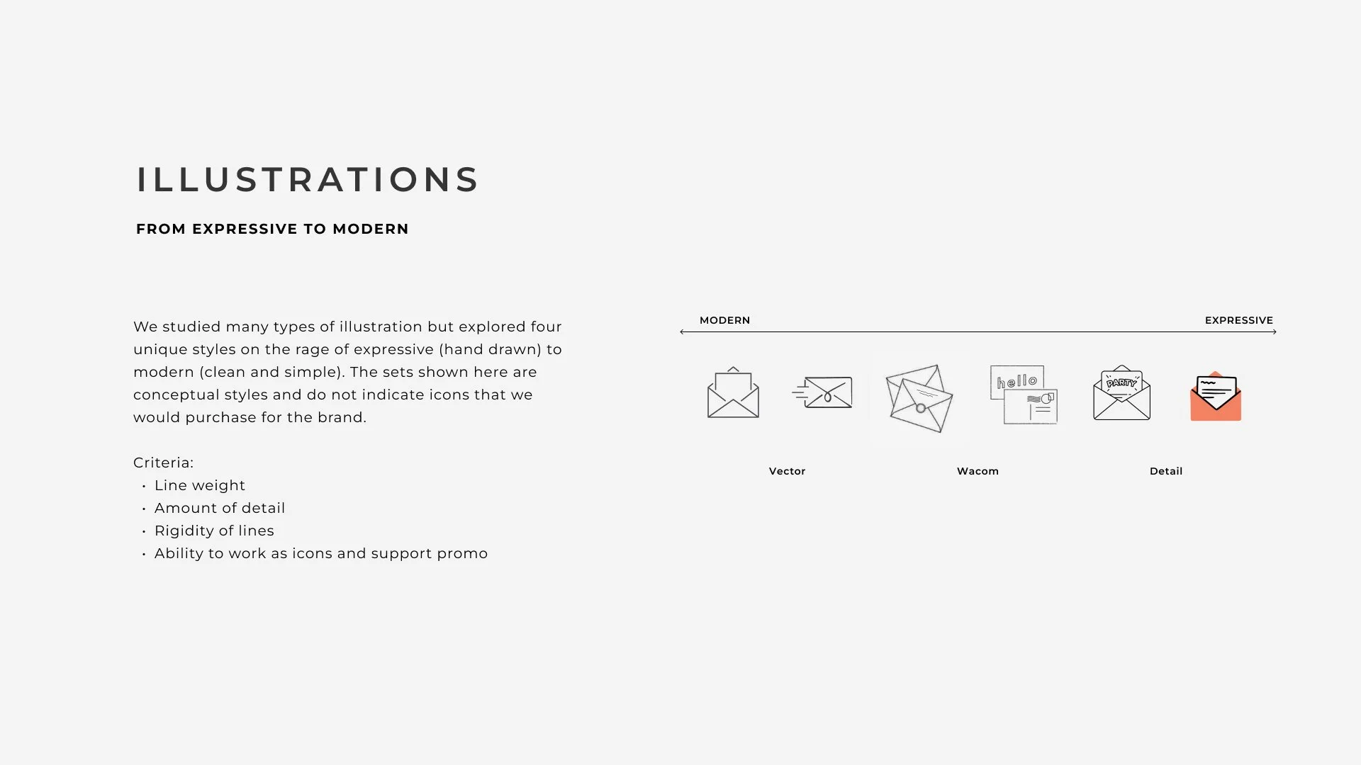
We studied many types of illustration but explored four unique styles on the rage of expressive (hand drawn) to modern (clean and simple). We also created a criteria to evaluate each set. The sets were showed at this stage were conceptual.
We narrowed the sets down to one we thought held the modern and expressive balance and could be executed on for Shutterfly’s unique products.
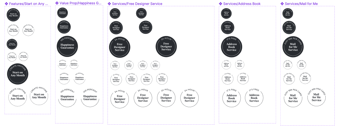
I created icon concepts of what we need to represent our services and a few other use cases. A couple designers and I tackled on the creation of the icons to put into use.
Design System
The consistent theme of the new design system was: use more simple elements that would build a more consistent and interchangeable system. I helped adapt principals that ACDs created for the website to a successful email system.
Key characteristics:
Simple layouts
Hero photography
Simple silos on a light gray background
Dedicated storytelling modules
Strengthened CTAs (consistent, prominent)
Approach from a content and story first perspective vs independent module thinking
Results
This project was characterized by a small team, quick turnaround and quick implementation. It had sign off and support from the brand team, through the Marketing VP and the CEO.
“I have never seen such great brand work by such a small team in a short time period. So thoughtful.”
Sizzle
I worked with a video editor to story board and hand off assets to create a sizzle reel that was showcased internally.
Guidelines
This project was a short turnaround and served as in between branding. Thus, the guidelines were formed quickly and not as thorough as would normally be. I updated the brand Figma library that housed colors, badging, and illustrations. Channel libraries were updated with new components.
Design and Art Direction: Jennie Soucheray, Katelyn McDonough
ACD: Bobbie Huckelberry
CD: Susan Dreiling


