Meet Archd.
Archd is an all-in-one software platform that simplifies the administrative process for home stagers (with the potential of expanding to other industries in the future). It includes inventory management, CRM, invoicing, and payment processing.
The target demographic is Female business owners that love interior design, age range 40s – 50s. This demographic will shift of the next 10 years and transition towards 30s.
Visual creative should be sophisticated, clean, classic, tech-based.
Brainstorm
I was excited to create concepts for this new brand because of the power of the name and strong visual connection. An arch is historic, iconic and is having a moment in all areas of design right now. There were a lot of different directions this mark could go, especially with an ‘A’ to start.
Sketches
3 Directions
My concepts ranged from a wordmark embodying a sleek tech feel to a modern traditional, which represents the current visual weight of interior design. I also created an option that aligns with Linden Creek, should it’s branding be related to the parent brand.
Concept 1: Ultra Modern Typography
Concept 2: Synergy with Linden Creek (parent branding)
Concept 3: Modern Blend
Revisions
The client wished to see iterations on 1A, with a slightly different ‘A' and 3B with more modern text vs an elevated serif. I still provided an option with a serif because the high contrast strokes and character of the font make for a unique modern statement.
Concept 1A Revisions
Concept 3B Revisions
Final
The client decided to move forward with the simple, clean type paired with an icon that represents an arch, entryway, and shows depth and futurism.
Brand Guidelines
A brand is not complete with complimenting counterparts and guidelines to ensure a consistent presentation across channels.
A bright and poppy color palette that anchors the UI
A type system fit for all instances—a software platform and marketing website
Logo usage guidelines
Software UI
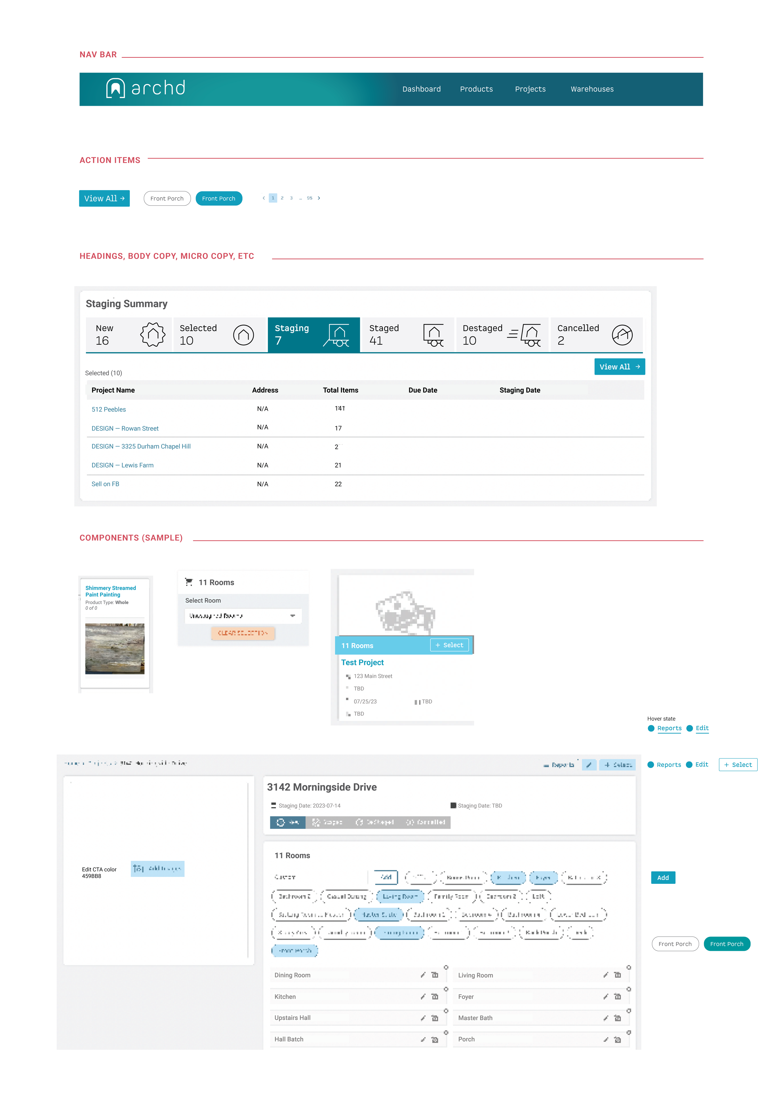
A development agency created the platform, including the UI and UX. I provided high level guidance, in addition to providing the brand guidelines.
Design: Jennie Soucheray


